CMA Fest 2019 Mobile App
Music Festival Mobile App
Overview
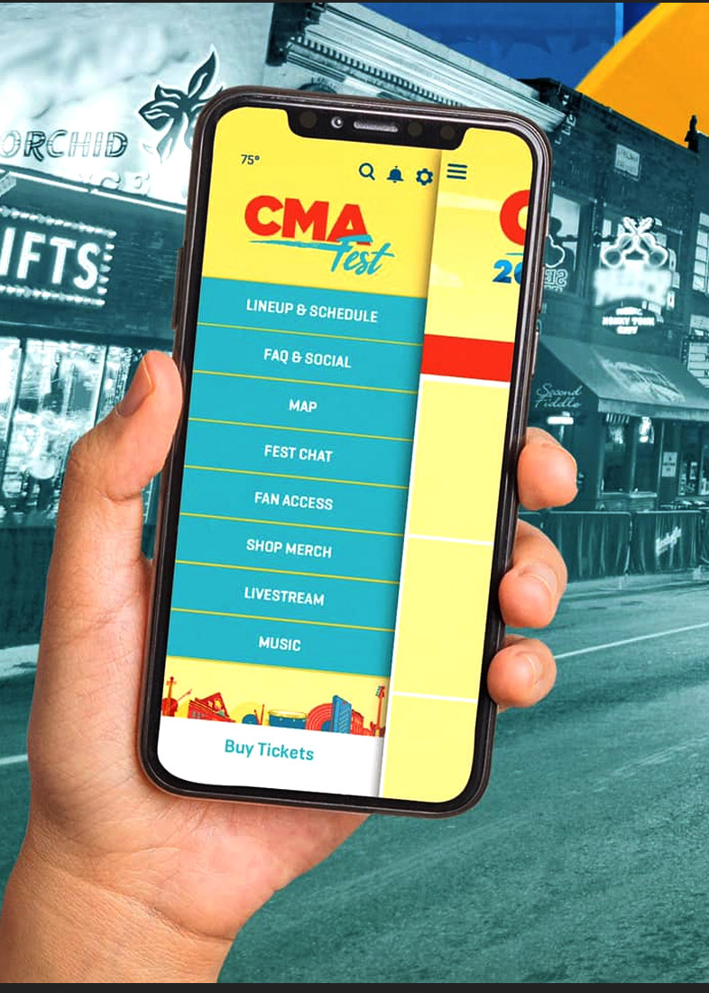
The Country Music Association, also known as CMA, hosts an annual music festival dedicated to country music (CMA Fest). The festival takes place in downtown Nashville, TN, and a mobile application is available to users in order to find stages, see schedules, view festival info, and more.
During my time at CMA, the developer house already had many of the UX/UI concepts completed in an early alpha APK of the app. However, some of these decisions were revisited and needed redesign. Since the developers were no longer working with the original UX/UI team, I was tasked with creating those conceptual changes to the UI, testing the user experience for bugs and pain points, and heading up the entirety of the Android UX testing and research (only two people at CMA had Androids).
Roles
UX Tester
UI Design
Applications
Adobe Photoshop
Adobe Illustrator
Figma
Duration
January 2019 – June 2019
Menu UI
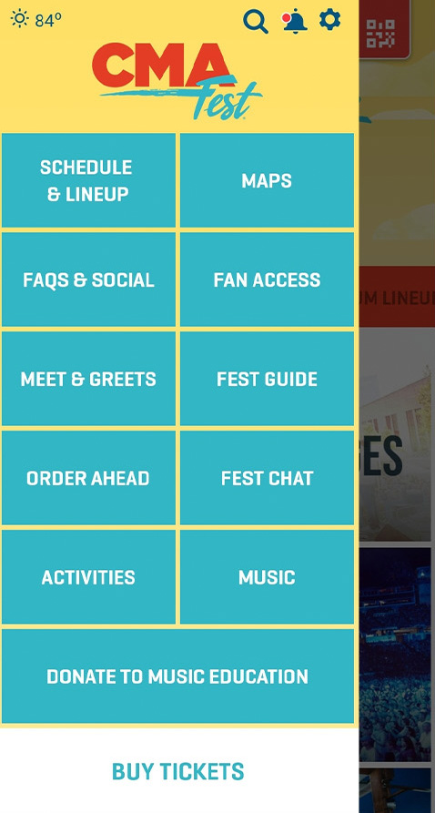
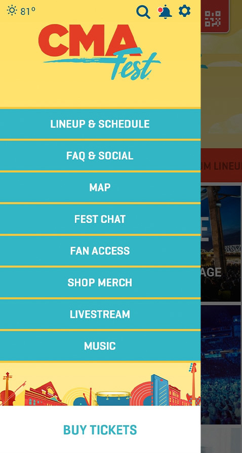
An immediate pain-point that the team wanted fixed was the menu. In alpha feedback, users had noted to the devs that having to navigate the menu in a vertical and horizontal way was annoying and tedious, given what the button sizes were on a mobile device. The team condensed down the necessary options (10 to 8), and I created a UI menu that only utilized vertical selection.
Before
After
Before
After
Partner UI
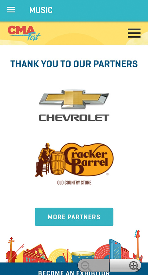
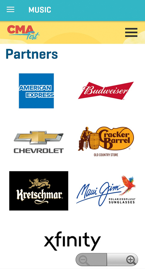
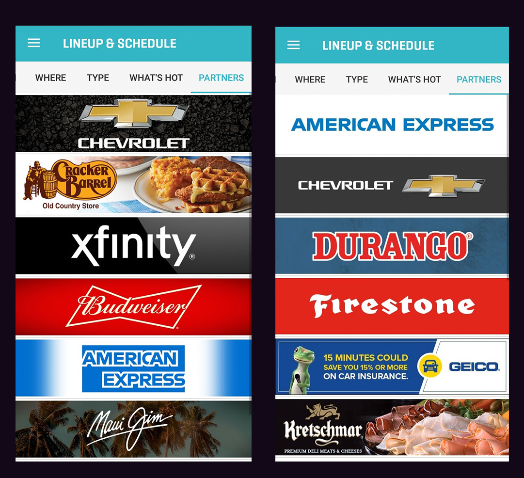
An example of one of the first changes made was to the partners page. When moving through the alpha, it was apparent that this page required an extra step to see all of the partners, causing inequality among all sponsors and partners. Additionally, the title left some awkwardness in the sizing. With a shorter, one- word title, the same information was conveyed with a clearer standing in the page.
Proposed Concept
My original proposed concept focused on a sliding menu of partners that could easily give equal screen space to each of the sponsors. Creative and brand partnership departments rejected the concept (rightly-so) due to the nature of the designs going beyond the logo for some sponsors. Simply put, this moved the inequality from screen real estate to design philosophy.
Before
After
Playlist UI
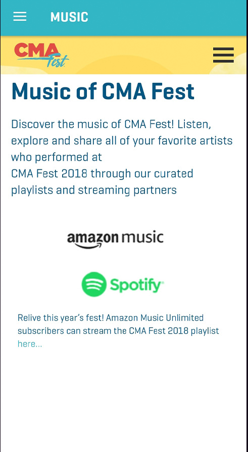
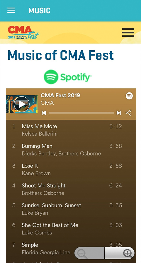
Developers had monitored users from the 2018 CMA Fest mobile app usage, and they realized that there was a low amount of engagement with the CMA Fest playlists. The 2018 build of the app required users to click on the streaming logo to be taken to an external player with no indication of what playlist they were being taken to. My UI mockup of the page took a different turn and had proposed a method of getting users to the playlists without them having to leave the app.
GPS UX
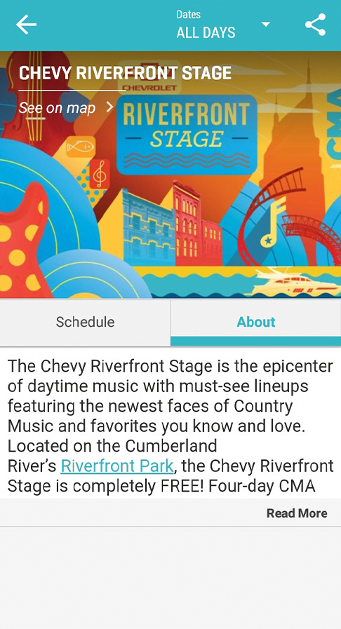
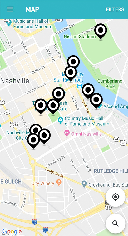
During alpha, I headed up the UX and product testing for the Android experience of the app. I was tasked with visiting every intended GPS pin for stages to see if the app was aware of my presence. Once at each location, I would report if the app triggered the performance stage information or if it did not register. Additionally, I would travel to the outer ends of downtown to test the geo fence and see how well a user could direct themselves from a further distance.
Forum UX
The CMA Fest app features a live chat forum for users to talk to each other as well as CMA staff and support. I spent many hours before the final build testing for bugs and features. Most notable was a performance bug that created a latency in the keyboard for Android but not iOS. This latency also caused the cursor to recall itself in the middle of typing, causing some words to be typed in the middle of. With over 20% of our users being on an Android OS, we had to be sure that this was addressed before launch. This bug was eventually fixed, and the Android package was launched with a fully functioning chat system.
Launch
The final APK package was built one month before CMA Fest and launched on Google Play and the iOS App Store. This was the final build after about 6 previous APK’s were tested across iOS and Android devices. Some issues came about that were not considered beforehand. One of these issues was the traffic in cellular towers. This made live-giveaway and stage updates difficult for users because their phones could not receive the updates, despite having great coverage downtown. Live monitoring of the geo fence allowed developers to understand some of the limitations that were not present on testing, and several tweaks and expansions to the geo fence were added.
Some successes included the forum solving quite a few issues for festival attendees that would never have been solved otherwise, due to the direct communication with staff. Festival and CMA playlist listeners were up across the board, and the forum allowed users to be able to make song suggestions during Nissan Stadium intermissions. The addition of live update information to stages and locations allowed several giveaways for Nissan Stadium and artist meet & greets to happen, and users were able to share some of their favorite moments with each other in picture, video, and testimonial form.
Conclusion
The app served its purpose and was an overall success. Some UI changes, such as the menu vertical change, are still in use to this day. Additionally, the playlist Ul changes are still commonly used in CMA applications to get music into the hands of users easier. This was my first ever UX/UI project, and I was satisfied with all of the experience gained from it, from the failures to the successes.
What Would I Do Differently?
Given that my seniority was low and my experience in UI is always evolving, there are some things that I could not influence. Additionally, we as a team had found certain things to have been much clearer in hindsight. The team was great, and our product made a bold and exciting drop onto the market. However, here are some things I would have approached differently, given a second chance:
Text Contrast – I had brought up at one point that it could be worth adding a drop shadow or an outline to some text. The white text over the cyan menu portions did not pass every single WCAG test. I had brought this up as a concern, but my suggestion did not make it to the final build. I would have advocated for this more, if given a second shot.
Cell Coverage – We had issues with users not being able to get proper coverage to their phones. This was due to overloaded towers that could not handle the capacity of festival attendees for the given area. This is not something that could have been avoided or combatted by the developers. However, I do think that it would have been in our best interest to invest more resources into physical assets such as map directories, audio announcements, and more signage. Relying on the mobile app for the main navigation of the festival is not an ideal method.