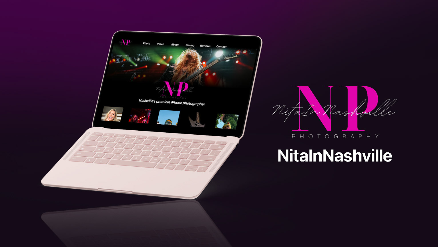
Nita In Nashville
Photography Website
Overview
NitalnNashville is the official name of the ambitious and growing business owned by Nita ‘Ann. Equipped with just an Apple iPhone, Nita has managed to create one of the most notable and trusted photography businesses in the Nashville, TN area.
I was hired by Nita to redesign her desktop website to a new layout as her business expands rapidly. I was the sole designer for this project.
Roles
UX Designer
UI Designer
Responsibilities
User experience design
User interface design
Usability testing
Competitive Analysis
Web design
Website creation (Wix)
Tools
Figma
Photoshop
Wix
Time
September 2022 – November 2022
Defining the Challenges
Before starting any design phases, the challenges and goals of the website redesign needed to be defined. A call with Nita allowed me to kickstart this process by better understanding why she was interested in a website redesign. I asked her to lay out some of the values she places on a photography website and to follow up with if she felt like her current website did or did not meet those those values. Here are the values Nita laid out that were not being met:
- Her website did not showcase her versatility. Nita had expressed that she did several genres of photography, and she felt that it was difficult for her current website to give users an accurate grip on how wide her skillset ranged.
- Nita wanted people to know she used an iPhone. With the iPhone camera being a factor that sets her apart from other photographers, it was important to her that users were able to see this clearly.
- The website did not drive visitors to her education courses. With her new courses on iPhone photography, Nita wanted to find a way to use her website as a promotional tool for the courses.
Research Overview
Once the challenges were defined, I wanted to do some research to create some design concepts as well as test later designs:
- Competitive analysis of other successful photographer/videographer sites
- One round of user interviews, pre-design (four users)
- One round of moderated usability testing on the prototype website (four users)
Similar Websites
M Kesting Photography
Strengths
- One stop layout for all essentials
- Powerful and large imagery
- Increased reputation from reviews
Weaknesses
- Some readability on text over photo
- Menu can be easily overlooked

Peter McKinnon
Strengths
- Great layout for genres
- Powerful and large imagery
- Unique Style
Weaknesses
- Very visually dependent
- Doesn’t tell me much about the photographer at a glimpse

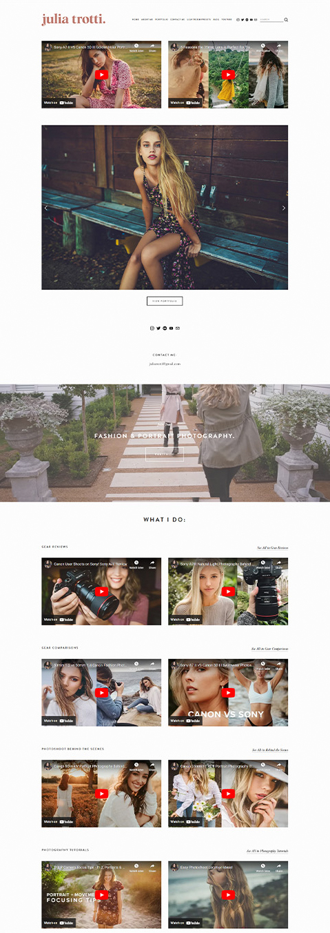
Julia Trotti
Strengths
- Incredible wealth of content immediately
- Cohesive and beautiful imagery
- Clean layout
Weaknesses
- “What I Do” hinges on third party content to explain
- Confusion on owner’s specific relation to photography/videography
Similar Websites


M Kesting Photography
Strengths
- One stop layout for all essentials
- Powerful and large imagery
- Increased reputation from reviews
Weaknesses
- Some readability on text over photo
- Menu can be easily overlooked
Peter McKinnon
Strengths
- Great layout for genres
- Powerful and large imagery
- Unique Style
Weaknesses
- Very visually dependent
- Doesn’t tell me much about the photographer at a glimpse
Julia Trotti
Strengths
- Incredible wealth of content immediately
- Cohesive and beautiful imagery
- Clean layout
Weaknesses
- “What I Do” hinges on third party content to explain
- Confusion on owner’s specific relation to photography/videography

User Interviews
The first round of user interviews focused on six questions answered by four users to help get a sense of what they found important in a photographer and their website.
- How often do you take pictures/have your picture taken?
- What is your relation to professional photography? (Model, photographer, editor, etc.)
- What are some things you value in a photographer?
- What are some things that give you confidence in a photographer you’re hiring?
- How do you measure if a photographer is good at their craft?
- What are some issues you have with finding the right photographer?
Interview Findings
- Users didn’t measure photographers strictly by one metric. Things such as quality of work, pricing, and uniqueness were all factors.
- Users do not enjoy having to seek out all of the information and work
of a photographer. They want to be sold on the photographer by the photographer, not have to convince themselves.
Ideation – Low Fidelity
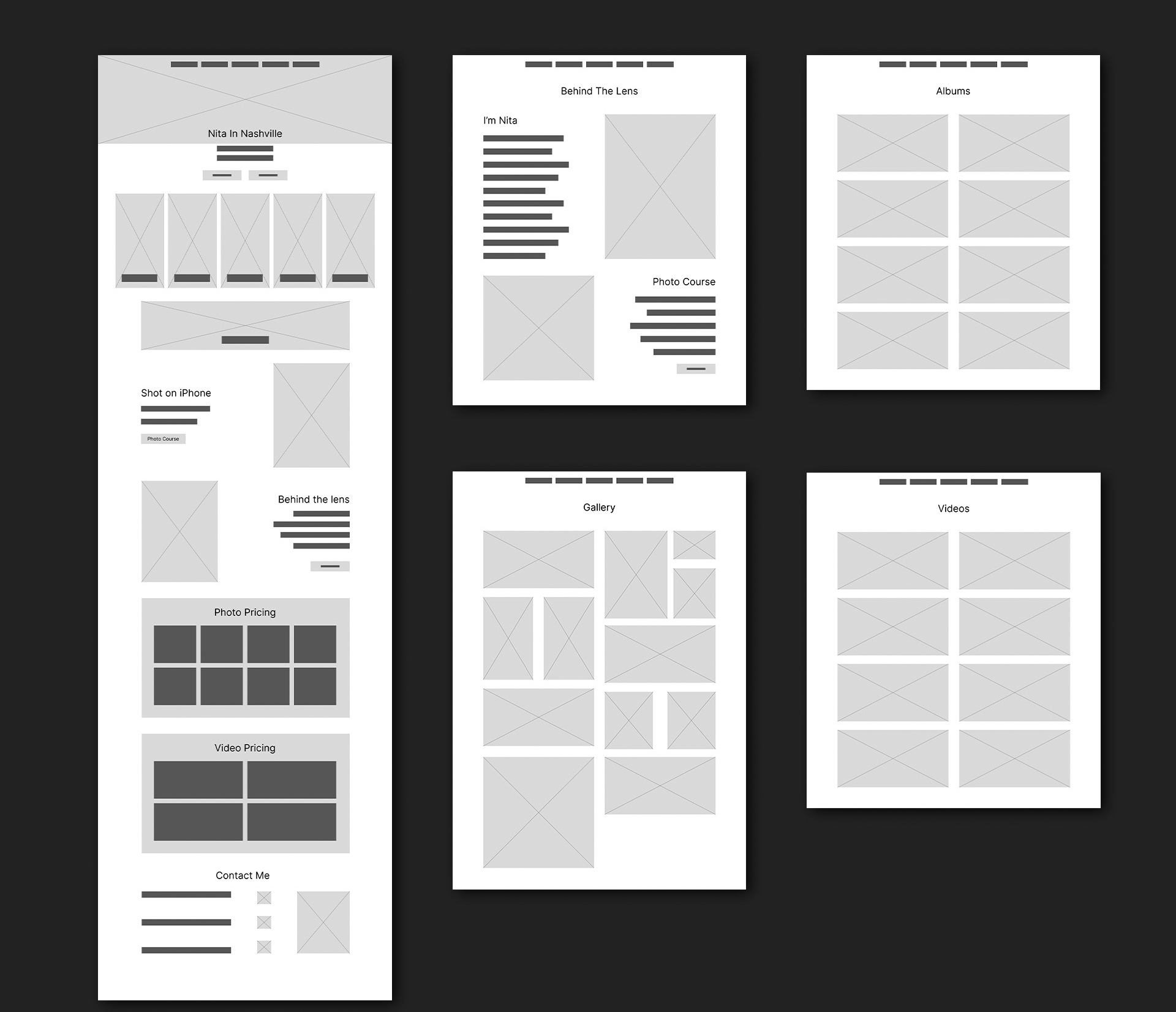
Low fidelity wireframes were created first. In this first version of the website, details and interview findings were reviewed with the site owner.
Ideation – High Fidelity
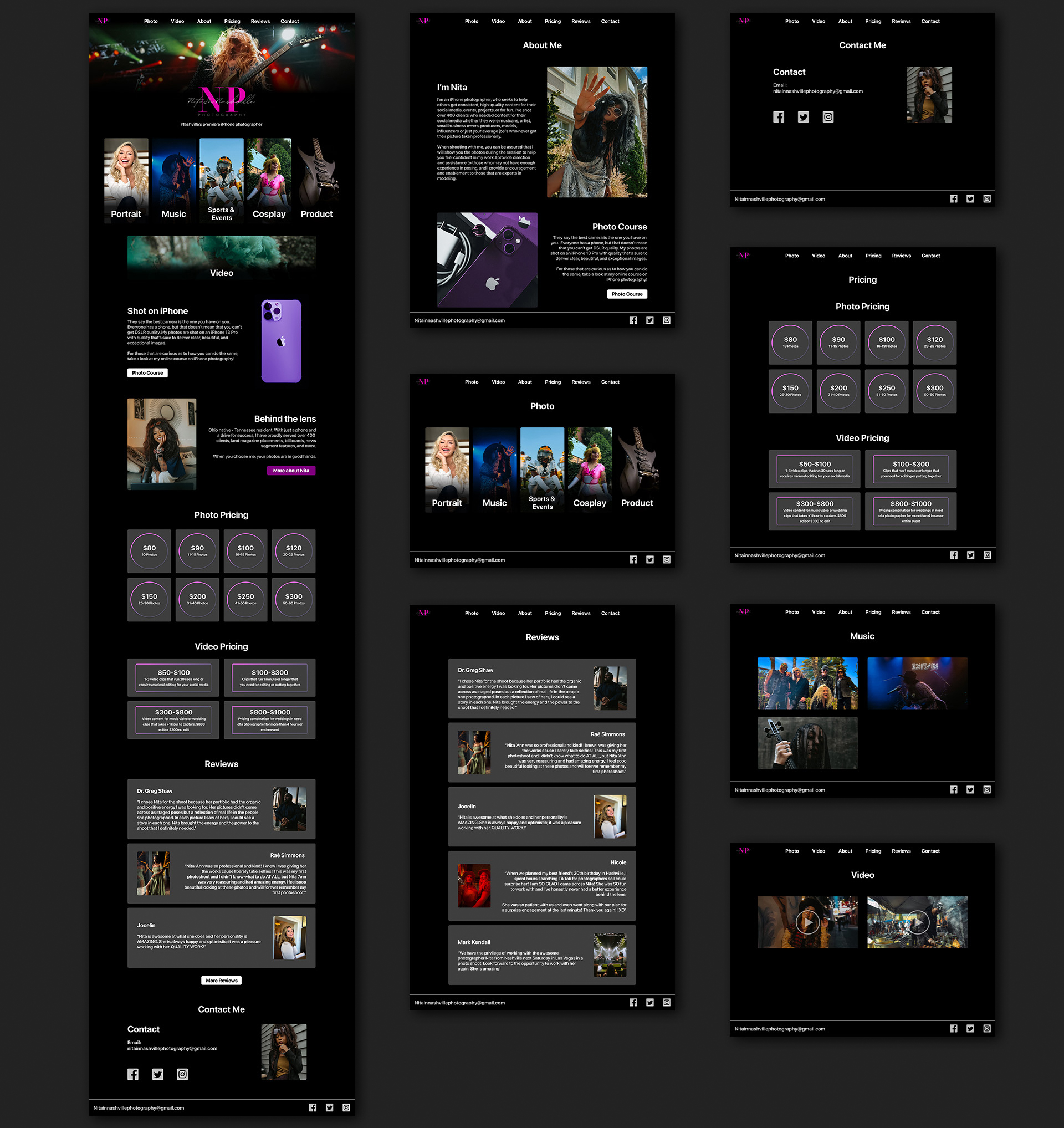
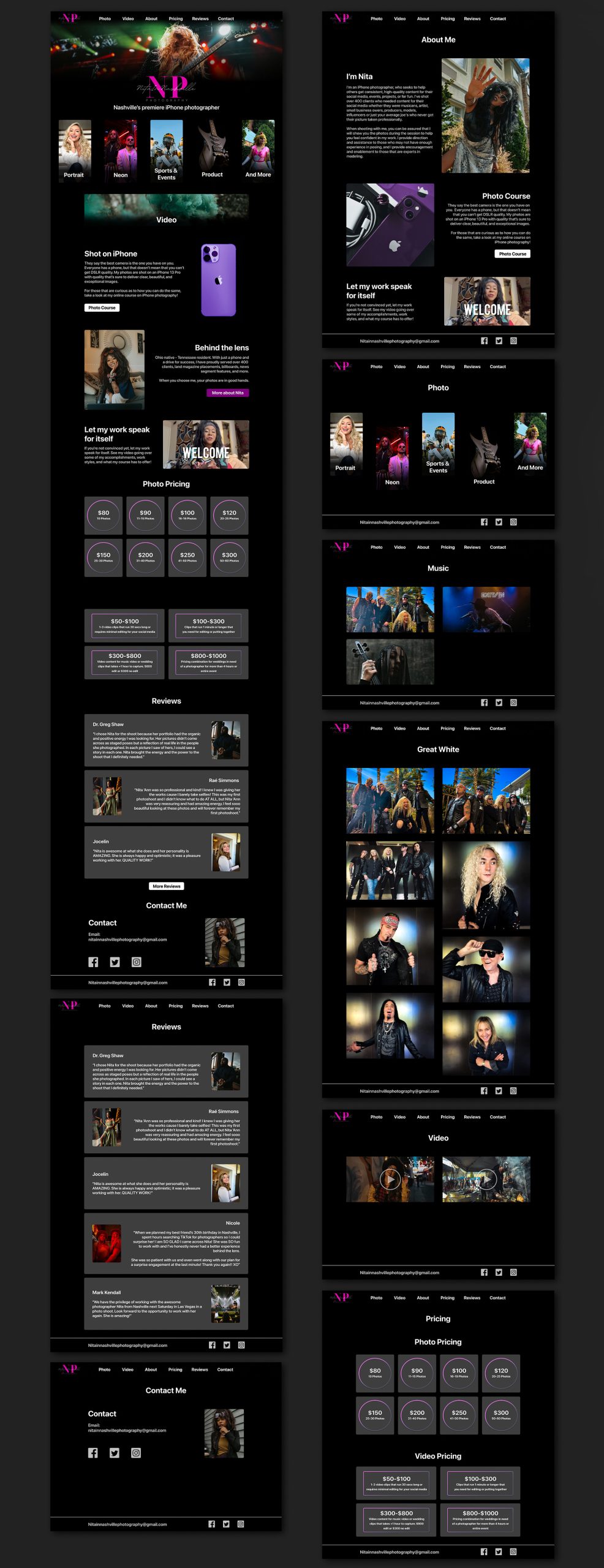
The low fidelity concepts were largely accepted by Nita, which kicked off the high fidelity phase. When creating these mockups, the layout was almost identical to the low fidelity wireframes with a couple changes that we had agreed on.
- Nita wanted a review section. To give some credibility to her work, she valued testimonials.
- Originally, photos, videos, and About Me were the only pages that branched off, attempting to keep as much information as possible to a single page. This idea still made it to the next stage, but we also decided to add dedicated pages to other sections such as pricing, contact, and reviews to allow users to choose their preferred navigation method while not sacrificing any screen real estate on the home page.
Iteration
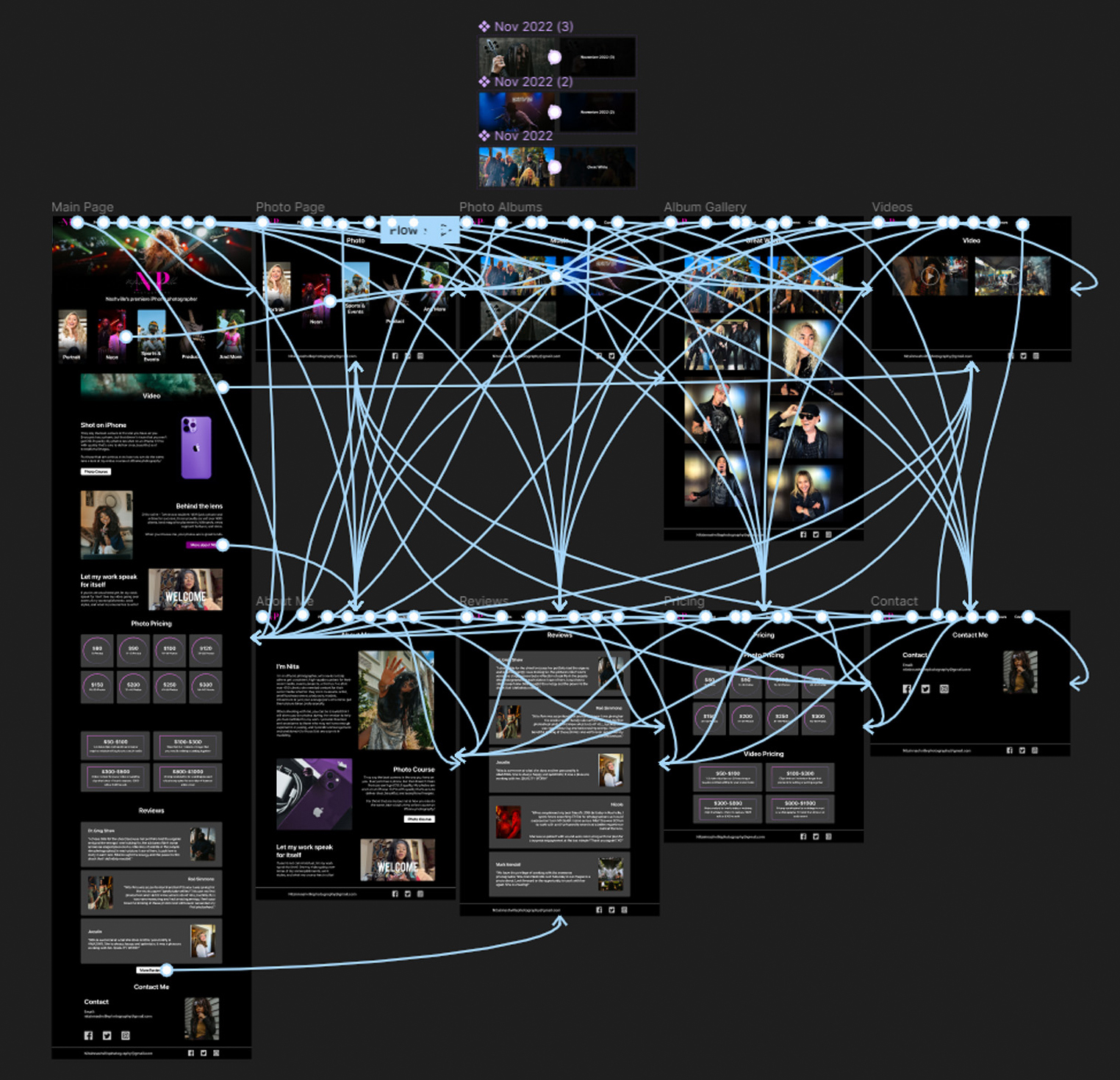
After the high fidelity designs were created, a working prototype was assembled for testing.
Usability Testing
Usability testing was done on four participants to determine the viability of the website prototype. This consisted of giving the participants a handful of pre and post-test questions. The main part of the test had them attempt to gather information based on four scenarios.
Usability Fixes

One of the fixes made after testing was an adjustment to the font sizing of the website title description and the top-left corner logo. Users had a slight complaint about those two aspects not grabbing their attention as strongly as they could have.
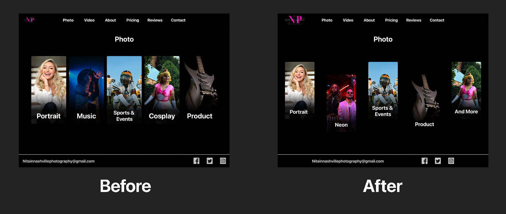
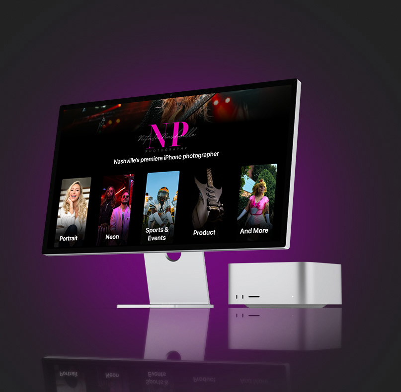
The next fix involved a visual change as well as a change in philosophy for photo navigation. When combining user navigation and Nita’s wealth of variety in her photos, it became apparent that a category needed to be created that would serve as the hub for any photos that didn’t fit into the previous categories. The “And More” category was created to combat this issue of shoe horning photos into inappropriate categories.
Additionally, a visual change was made to the card alignment. A user had mentioned that the similarities to the card layout on the home screen had tricked them a couple times into misreading which screen they were on. By shifting the cards on the Photo screen just a bit, it helped the layout differentiate from the home page.
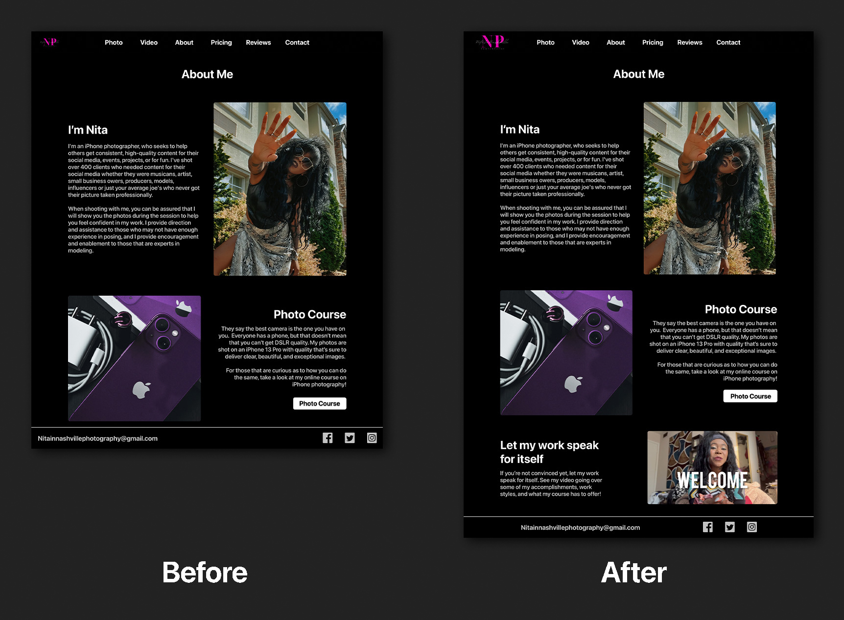
The fact that Nita only uses an iPhone was made obvious enough that it was pointed out very quickly by all users. However, it was noted by more than one user that while her work was very good, they still wanted to know just a little bit more about what this might look like in practice. I had prompted Nita to send me a video showing her credentials on the news as well as her explaining and demonstrating some of her work practices to help that credibility hit home even harder.
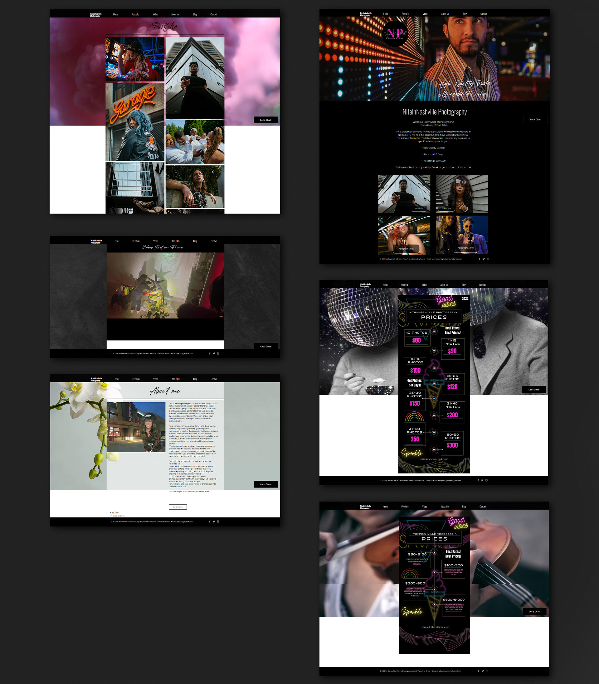
Original Website
Redesigned Website
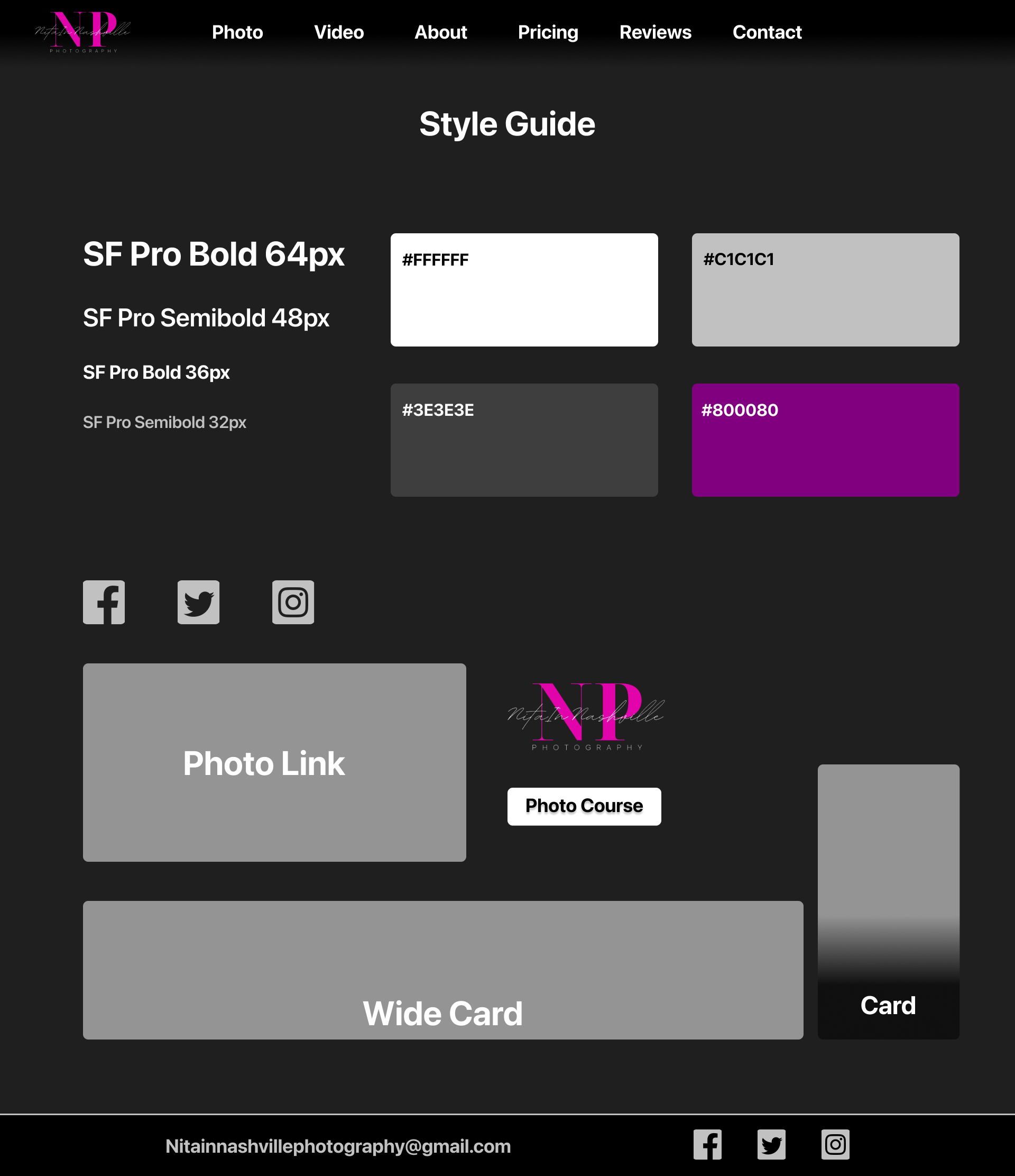
Style Guide
Conclusion
The website has successfully been delivered, and I was able to put it together in Wix. While there is no hard data on the website’s performance as of now, I have received positive feedback and satisfaction from Nita on the design and functionality. All of the albums have been uploaded, and she has been getting great compliments on the redesign from new and returning clients.
Challenges and Compromises
Fortunately, the design needs between Nita and the tested users had quite a bit of overlap. Not many compromises were made, but some notable changes did make their way into the final site, including:
Users had expressed wanting more contact info. This idea was brought up, but Nita had expressed that too direct forms of contact had bogged down her calendar and productivity in the past. Due to this, we ultimately decided to stick to just email, a method of communication that she functioned the best in.
Not a compromise, but there was a bit of a challenge in finding the correct genre cards for the Photo page. We struggled to determine the correct and most impactful albums to link to before finally settling on an all-encompassing card called “And More.”
What I Would Do Differently
I felt that this project was successful. Luckily, there aren’t too many things I would change about my approach, but that doesn’t mean everything went perfectly. The biggest thing that I would have done differently is that I would have planned around the limitations of Wix right from the beginning. I knew Wix had limitations, but I really should have taken better inventory of those limitations in order to help my hi-fi designs transfer into practice much easier.
My other wish is a minor nitpick, but I still believe could have helped. During the initial user interviews before the design phase, I wish that I had asked for some harder examples of what people valued in a photography website. I asked them for concepts, traits, philosophies, and more. However, I wish that I had simply asked, “Do you have any examples from photographers that you like?” I believe this would have made the design phase go by much faster.